Sometime in the middle of September, I was enjoying dinner out with friends but having trouble hearing the conversations around the table. But one voice was pitched at just the right register. That was Deborah Schnieder’s—someone I just knew casually. I don’t know how we got to talking about Ukraine, but when we did, other conversations ensued.
I had learned a bit about post-war Ukraine when I was teaching in Poland. I knew that their respective borders shifted after World War II when eastern Poland became western Ukraine. In fact, Ukraine has endured periods of Polonization and Russification for over three centuries. That evening Deborah gave me a more present tense perspective.
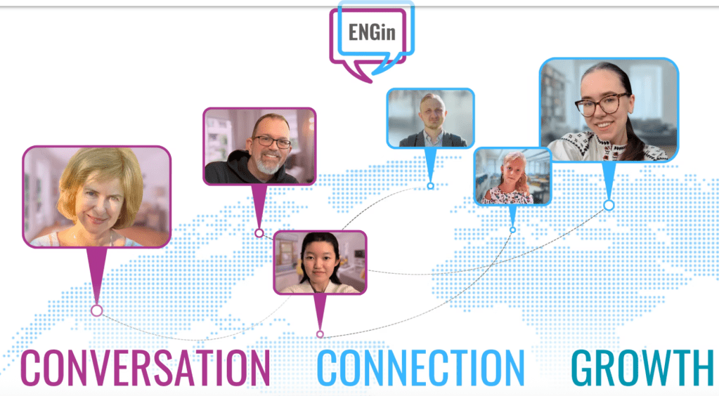
She told me that she volunteers with an organization called ENGin (https://app.enginprogram.org/#/home). It’s a non-profit which matches Ukrainians with English speakers—not people of Ukrainian descent in the U.S. but citizens in and of Ukraine. The program is designed to help participants improve their English through weekly Zoom calls—a 21st-century form of pen pals. But when Deborah told me that she’s been talking with her ENGin partner in Kyiv for more than two years (often hearing drones in the background), it was clear this wasn’t simply a matter of language coaching. Becoming involved with ENGin involved personal encounters and the potential for friendships with individuals living with the consequences of war.
After that dinner Deborah introduced me to another volunteer, Mary Sheerin, a 91-year-old life-long activist and educator. We met up at Mary’s house because I wanted to learn more about ENGin’s program while I was waiting to be assigned my own partner. I was especially curious about why they got involved, given that Ukraine is so far away (psychologically and geographically) from upstate New York and the conflict doesn’t really affect their daily lives. Or does it? As philosopher Kwame Anthony Appiah points out in his book Cosmopolitanism, today we encounter more people than our ancient ancestors would have met in a single day. He argues that in addition to having responsibilities to our ‘kith and kin,’ we also have responsibilities to those who we know of through our virtual lives. While tacitly embracing Appiah’s global notion of ethics, Deborah and Mary also had a more pragmatic answer to my question: why care? They both see Ukraine as the frontline in the fight for democracy against a rapacious Russia (a.k.a., Vladimir Putin). They both recognize that the conflict could lead to NATO’s involvement, which would mean our involvement. So maybe not so far away after all.
In any case, ‘far away’ is relative in cyberspace. Mary’s Zoom partner Viktoriia is originally from Kyiv. She is a 25-year-old web designer who is currently living in Munich with her mother. They moved after the house next to theirs was bombed. She’s largely apolitical and doesn’t want to talk about the war at all. Instead, she is more preoccupied with her social life within Munich’s tight-knit Ukrainian community and tells Mary she’s having fun. (What 25-year-old doesn’t want to have fun?) Viktoriia is glad to be in Germany where support is generous, including free language lessons, four hours a day. She and Mary tend to talk while Viktoriia is walking around the city, one Mary is familiar with, so they have that in common, as well as the pleasure of conversation.
Deborah’s partner Eliza has been more peripatetic. When the war began, she moved from Kharkiv (a city near the Russian border regularly under siege) to Poland and then back to Kyiv where she works remotely for Nestle as a user experience designer. Deborah says they do talk about the war because it’s ever-present in Kyiv. Eliza, who is 34, follows the politics of Ukraine and the U.S.—as you would if bombings were a regular feature of daily life. She lives on the 19th floor of a high rise building where the electricity goes out and elevators stop running during air raids. (In fact, she and Deborah haven’t been able to connect much at all lately as her internet is often down due to the uptick in Russian attacks.) So naturally Eliza is deeply disappointed by U.S. vacillations on its support, not to mention its recent betrayals during peace negotiations. For all that, Deborah describes her as resilient and upbeat. In addition to talking about how she copes physically and emotionally, they also talk about her love of dogs and her tango lessons. Well-traveled—she took a vacation to Greece last year—Eliza enjoys her independence even though she’s considered a bit odd for living alone. She suffers the stigma of being unmarried at her age. Her self-consciousness of her single status, as much as her stories of the pleasures of daily life, is a reminder that being Ukrainian isn’t synonymous with being a victim of war.
Shortly after meeting with Mary and Deborah, I was connected with Olha (Ukrainian for Olga), a 41-year-old woman who left Ukraine for Romania with her husband and two daughters, aged 7 and 12. Like Viktoriia, Olha left in 2022 when a house next door was destroyed. (They chose Romania because they can occasionally make the 12-hour drive back to see family who have stayed behind in Kharkiv.) When she first arrived, Olha worked with a humanitarian agency helping displaced fellow Ukrainians; but listening to them talk about the atrocities they witnessed and suffered, especially in Bucha, took its toll. (She’s since left that job.) Now adrift with no career prospects in sight, she’s putting her energies into learning Romanian, a romance language with few words in common with her own. This is a different kind of courage that we often underestimate, taking it for granted (and often demanding) that immigrants should write and speak in their new countries’ languages, all the while they deal with the trauma of displacement. It’s hard to comprehend without talking to someone who is going through that transition; just as it’s impossible to come close to understanding the realities of staying put without hearing about it first-hand.

Nora Krug’s War Stories, pp. 104-105
It is easy to underestimate the value of small conversations in the face of the current avalanche of dispiriting news from Ukraine and elsewhere. Which isn’t to say that these conversations aren’t sometimes fraught, as I’m finding with Olha. After our initial Zoom, which was largely an exchange of pleasantries, I sent Olha scans of a couple of pages from a book (Nora Krug’s War Diaries) about the experiences of an artist who flees Russia because he feared Putin’s persecution and a Ukrainian journalist who commutes between Ukraine and Denmark (where her children live with their grandmother). I quickly learned that sharing my scant knowledge of the conflict (meant as sign of interest in her world) wasn’t helpful to Olha. This isn’t an abstract issue to be read about in a book. She didn’t want to hear these stories, especially any that had Russian protagonists.
Since then, we’ve spoken several more times, largely about our families, daily routines, and, more recently, holiday rituals. Somehow Easter survived the communist era’s disdain for religion. Christmas, however, took a hit, leaving Olha with few traditions and feeling estranged from the festivities around her in Romania. (She lives in the country’s second largest city Cluj-Napoca, which is fairly cosmopolitan.) The one time we touched on the war was when she told me that her 17-year-old nephew was leaving Ukraine to live with her to avoid the draft. When I asked how that might work out, Olha said he was happy to come. In any case, he has no friends his age in Kharkiv, as most boys had been sent out of the country long ago.
Even more valuable than the particulars of our conversations is the fact that, over time, they pierce the numbness created by one headline after another and the nightly doses of war pornography that I see on television. For both of us, they offer a time for confidences of a purely personal nature whether it be about family members, hair styles, or house plants. Olha’s status as a ‘refugee’ is, if not irrelevant, then too reductive.
Our conversations put me in mind of an essay by the Croatian journalist, novelist, and essayist Slavenka Drakulić, written against the backdrop of the wars that erupted after the disintegration of Yugoslavia. She herself had been a refugee, living temporarily with her sister in Paris, who asked her what she needed. Conditioned to thinking of refugees as only needing (and, by extension, deserving of) bare necessities, her sister was shocked to hear that she wanted lipstick. Even in this familial setting, culturally ingrained assumptions prevailed—specifically the assumption that Drakulić had no need to differentiate herself, to exercise her taste or flatter her appearance. She wasn’t a woman, she was a ‘refugee.’
Perhaps this misperception is the underlying reason for Olha’s avoidance of talking about Ukraine. (And for that matter, Mary’s partner Viktoriia’s as well.) The benefits of displacement—safety and the semblance of a ‘normal’ life—are countered by alienation. Olha worries that she is somehow lacking—that she has no career, no identity, and few traditions. She is embarrassed about her disorientation. No matter that her dislocation wasn’t of her doing. But then all of us feel a measure of awkwardness when we think we embody a contradiction of social ideals. For me it can be the fact of being retired, of being older and very possibly irrelevant; though these ‘displacements’ pale in comparison with Olha’s. So, instead of being curious about Ukraine, per se, I am more drawn to the commonalities we share. The hope is that we can cultivate a mutual recognition that surpasses my status as a voyeur and hers as a displaced person—one that is vital in dark times, one that supersedes geopolitics.